
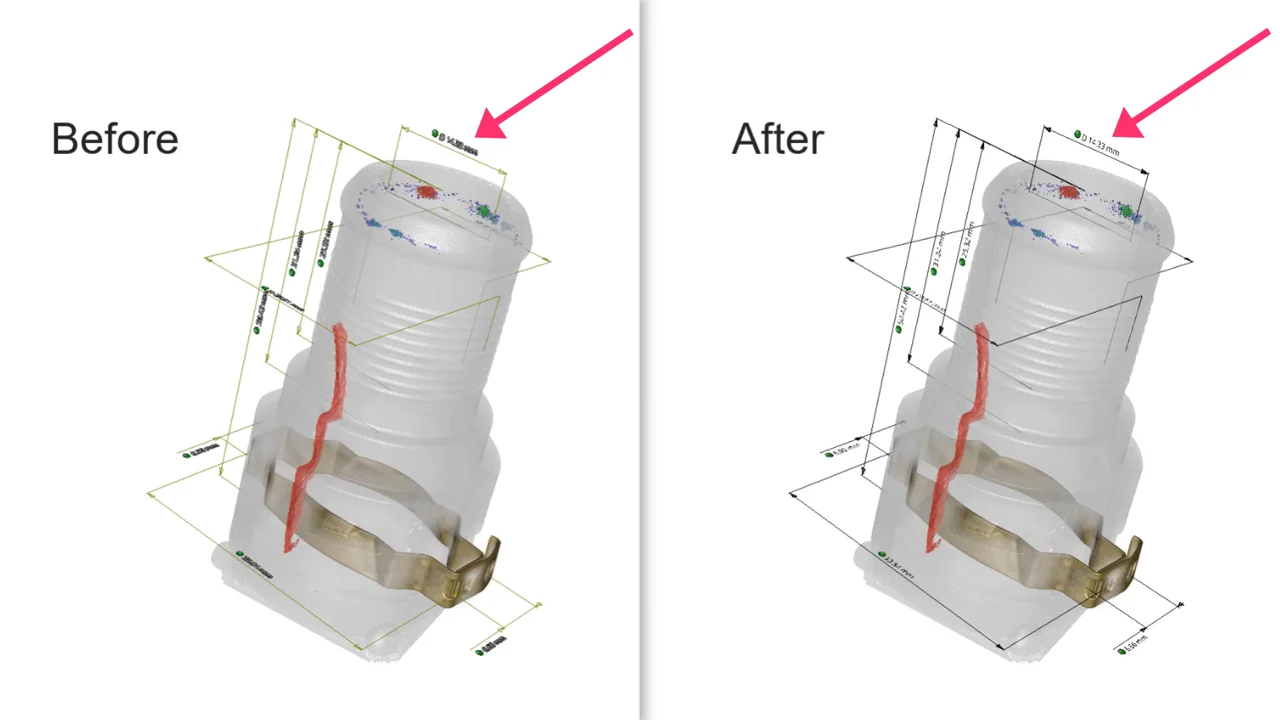
Art is not always subjective—at least in the world of CT scanning. Sometimes, the high or low quality of an image has little to do with personal taste. There are definitely a few factors that can affect the appearance—and quality—of an image.

Dark, dull, and kind of blurry
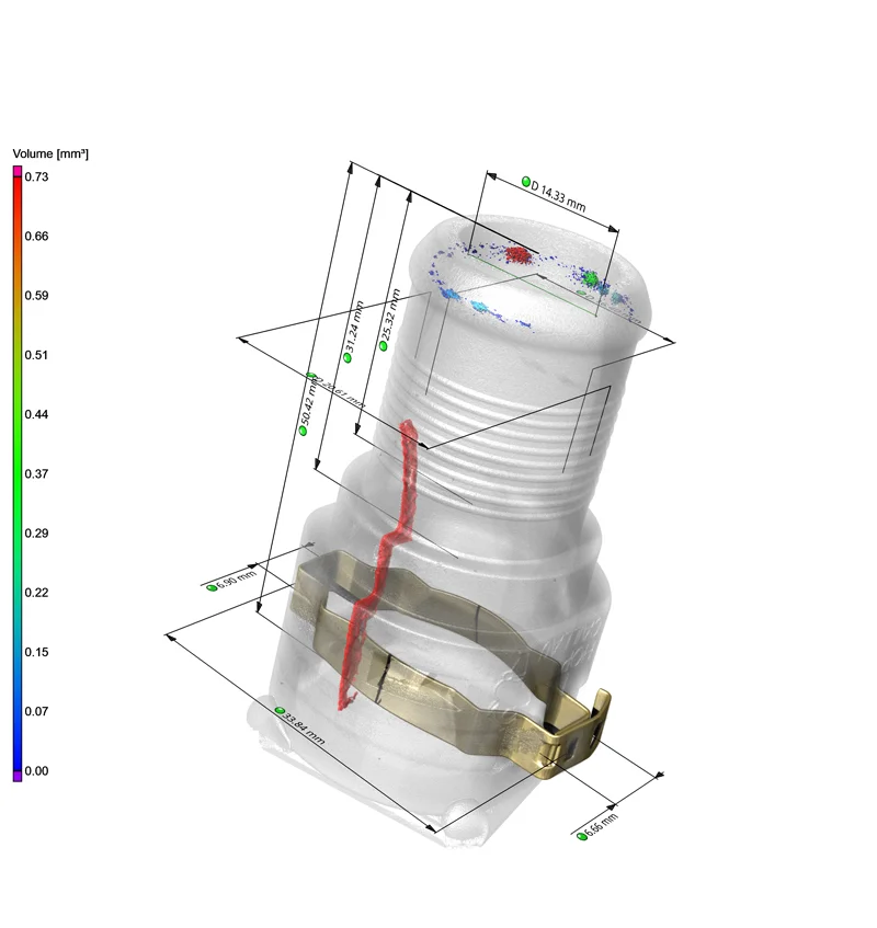
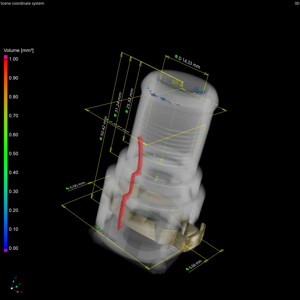
Bright, high-contrast, and focused
Both images were taken in VGSTUDIO MAX. Although they show the same connector and present the same information, one is clear and crisp, while the other feels like we need glasses.
Let's take a closer look at how to create high-resolution, professional-quality images from blurry screenshots!
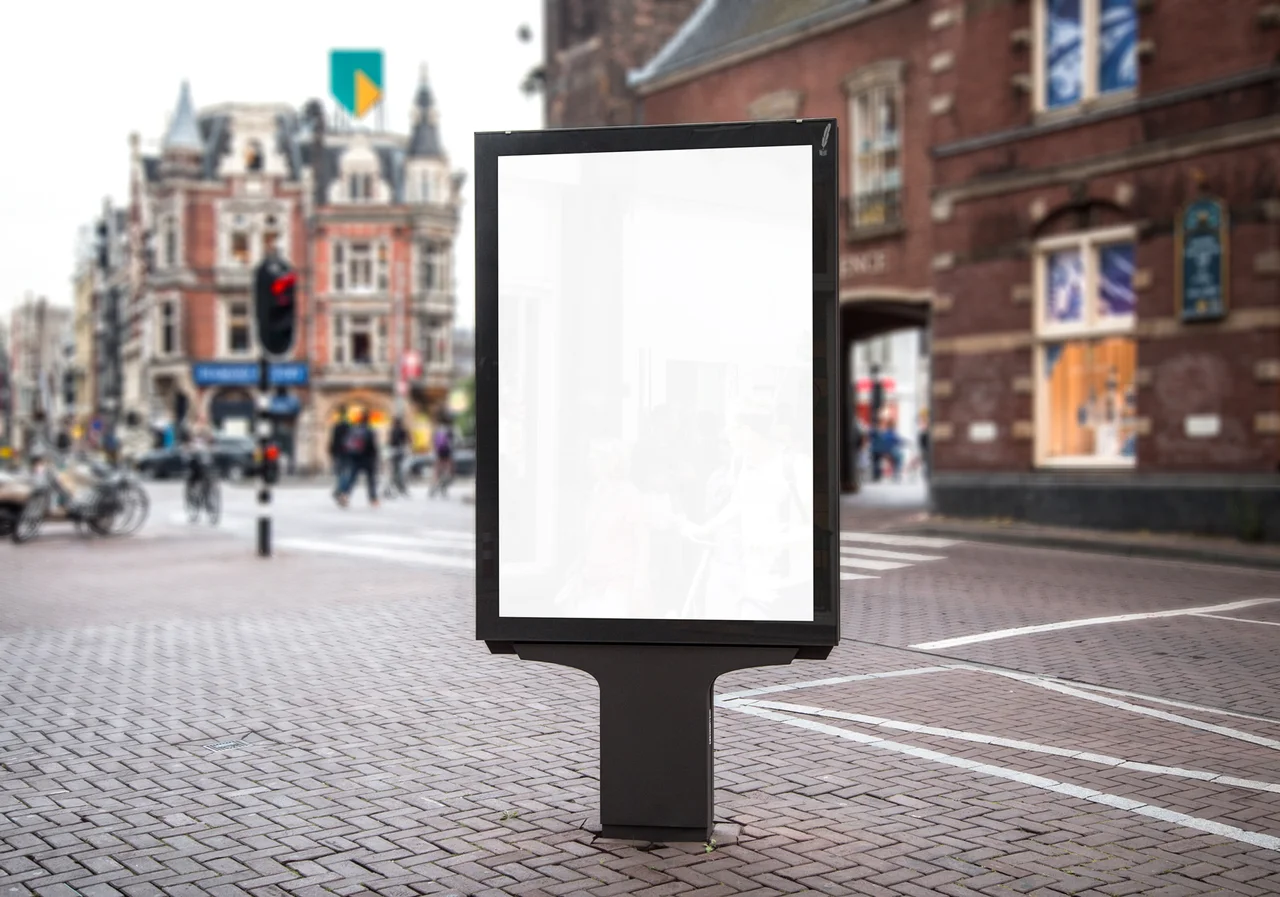
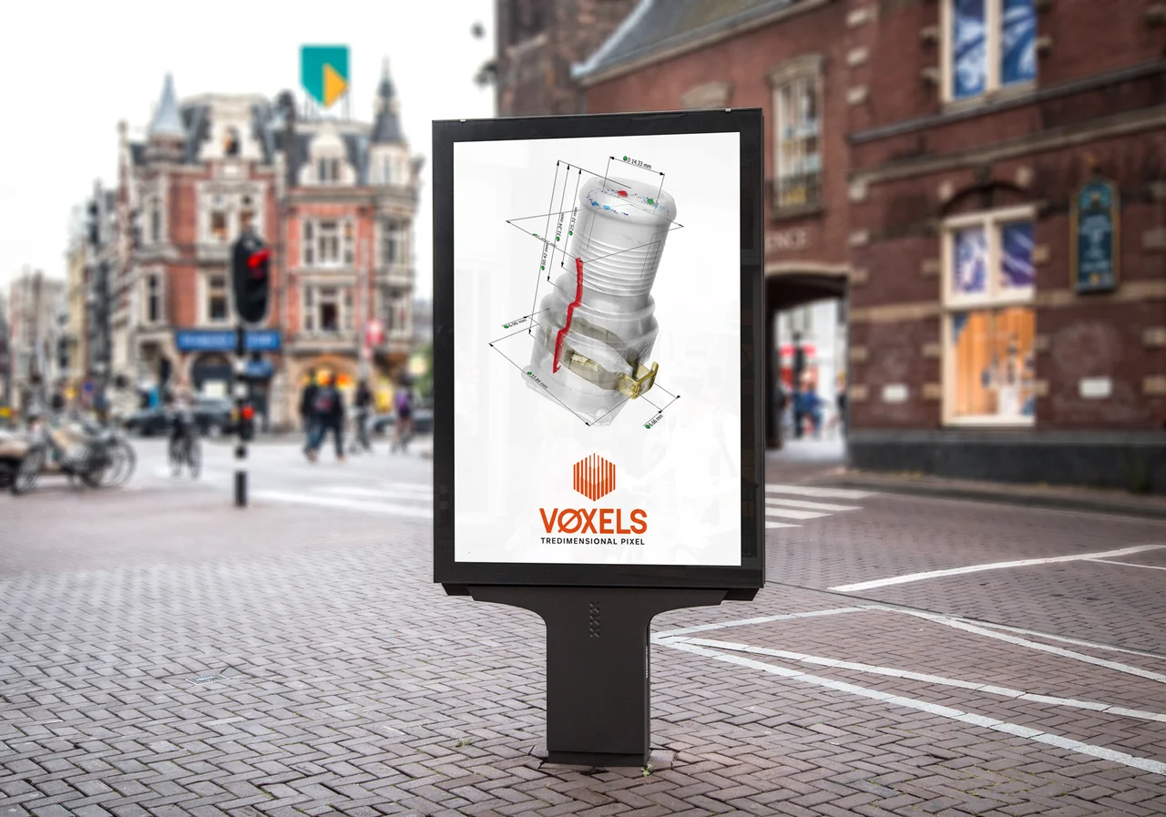
Marketing paid a lot of money to book a great spot. We better not disappoint them.
Background
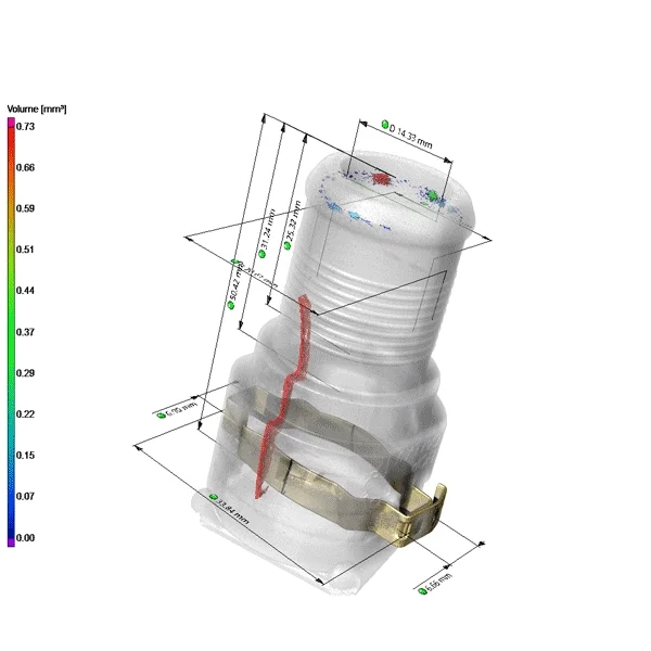
Away with the default background gradient! Monochrome (flat) backgrounds are usually more timeless. Plus, they have a big advantage: a flat background is much easier to integrate into a given layout. It also makes cropping easier and less noticeable later.
Since our poster has a white background, we will also supply our rendering with one.
Remove the Clutter
Each standard image element has its purpose... in VGSTUDIO MAX. On a poster, they are usually of little use. Best to turn them off.
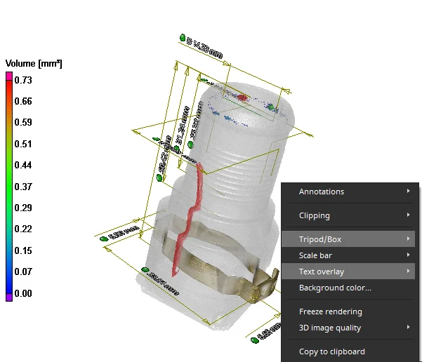
Text overlays and the tripod can be turned off using the context menu in the 3D window.
Color Bar: Yay or Nay?
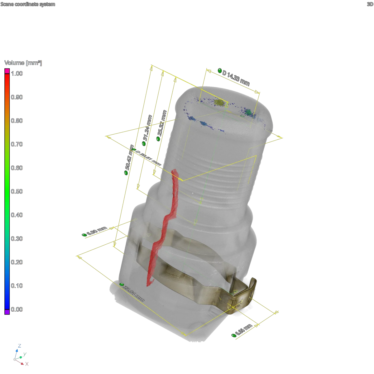
Does your image need a color bar? To the viewer, they might not always be of much use. Still, if you decide to keep it in, you can at least make it look good. This includes making sure the font is easy to read on a white background. Open the "preferences" window and adjust the "color bars" under "color & styles." For example, take a black font and switch off the outline.
You can also adjust the length and width of the color bar if the default values aren't quite right for you.

Color and outline settings in the "preferences" menu
Now that the font is fine, let's talk content: choose the unit and the decimal places that make the numbers meaningful but not overwhelmingly large.
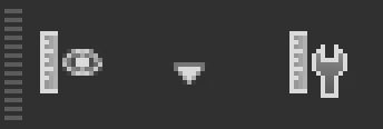
To quickly access both components, use the “unit” toolbar, which you often find hiding in the upper right corner of the menu.
Is it me you're looking for?
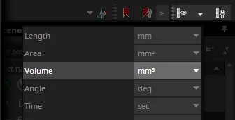
Choose the displayed unit in the "unit" drop-down menu.
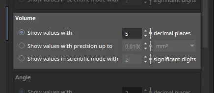
Set the number of decimal places in the "units > basic" entry under "preferences."
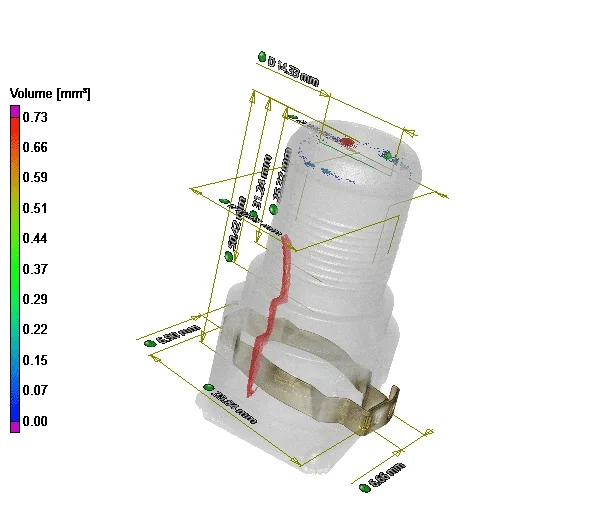
Cleaning up the scale: choose reasonable units and decimal places.
Increase the Contrast
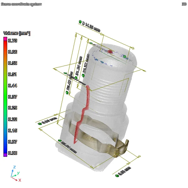
In the image, you can see not only the actual object, but also some lines, arrows, and numbers, though some of them hard to recognize. In terms of contrast and readability, there is still some room for improvement on the white background.
As you can see in the video, we take care of the numbers first. We also choose a black font and deactivate the contour line. Then we change all lines drawn from the default mustard color to black as well as fill in the tips of the arrows.
At this point, we won't change anything in terms of font size, line width, or arrow sizes yet. We do that globally at the end in the Save Images dialog.
Finally, the Light
In this case, we use a strong "Key Light" that runs diagonally from the upper left and a dim "Fill Light" that runs diagonally from the right. Both light sources are directional lights, which makes them easy to control in the 3D window. The shadow effect of both sources makes the rendering look more realistic.
Combined with the strongly transparent render settings, this gives us a clear glimpse into the object.
Two directional light sources highlight the data set.
Save Image (Ctrl + Shift + G)
The image now looks good and can be rendered in the "Save Image" dialog (for more details on the menu, check this out!).
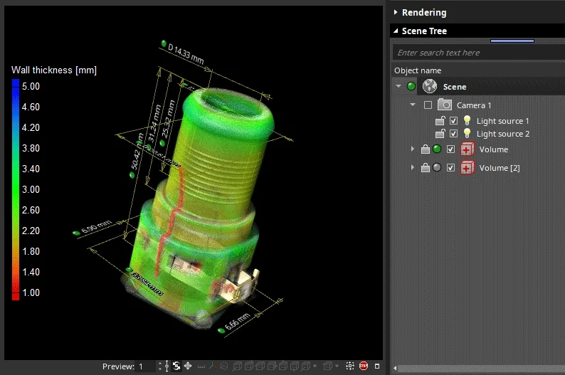
Before we set the desired resolution, we can first use the DPI slider to globally control how large our fonts, lines, and arrows should be displayed. By adjusting the value, the image elements will be enlarged or reduced accordingly. Since this image is intended for a poster, it might be better to go down a bit so that the numbers aren't too overwhelming later.
By the way, if we spontaneously decide to get rid of the color bar or all the measurements later, we just need to uncheck the corresponding checkboxes.

Elements have been scaled to 100%, 90%, 80%, and 70%.
Finally, set the desired resolution. Of course, when in doubt, a higher resolution always looks better, because edges, lines, and fine structures look smoother, less stepped, and simply more aesthetically pleasing that way.
But with great resolution comes great render times. For comparison: Because of the fancy render settings (Volume Renderer, Transparency, Shadows), this image took about a minute to render just in 1K. In 4K, it took roughly ten minutes. For a poster with a resolution around 10K, it would probably need an extended lunch break.
Either way, when the image has finished rendering, save it, send it to your marketing colleagues, and look forward to spotting it somewhere soon.
Hmm... somehow, they didn't seem to like the color bar. Oh, well. We tried.
Colorful Backgrounds
Even though it seems that the world is dominated by white posters, there are countless colorful variations.
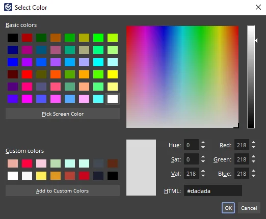
That is wonderful! Whatever color you (or your creative people) have chosen, simply copy RGB or hex values and paste it in VGSTUDIO MAX. That makes it really easy to follow any style guide.
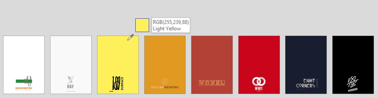
All logos and companies are completely imaginary. But hey, the colors are real!
Whenever you define colors in VGSTUDIO MAX, you can store them by just dragging them into your personal color swatch to always have them at the ready.
Oh, what a pleasant surprise: all colors are already in here.
By the way, if you just quickly need an image for PowerPoint, just copy the current image to the clipboard, paste it into your presentation, and you're done.
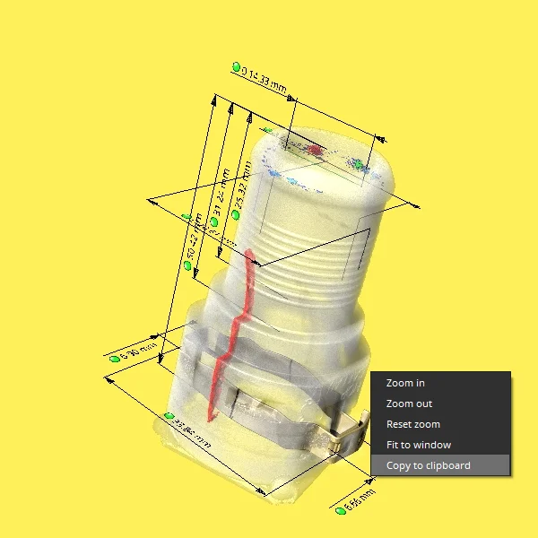
This works in all windows: Access the context menu to copy the current image to the clipboard
If the background is on the dark side, we recommend using lighter overlays. Repeat all the steps above and set the values there from black to white.
It sounds like a bit of work at first, but you only do it once. Because then you can save all these settings as a preset and bring them up later on with a single click.
Transparent Background (RGBA)
In some cases, there is simply no way around a transparent background: be it to generate an elegant freestanding logo, or perhaps to make last-minute adjustments to the background color without having to re-render everything.
Even though VGSTUDIO MAX does not support the direct output of such image formats, it provides all the means to generate a TIF or PNG with transparency in the graphics editor of your choice.
Did You Know: Alpha Channel
The key to transparency lies in the "alpha channel," which stores the transparency for each pixel. In other words, this channel contains the information it takes to separate an object from the background. Add this extra A to your RGB to get rid of the background.
Like red, green, and blue, this channel uses an 8-bit grayscale. Here, white represents full opacity, and black represents total transparency. As such, semi-transparency" in all its variations is found somewhere in between.
Oh, and keep in mind: the alpha channel works completely independently of the light; it only takes the opacity of the visible objects into account.
That's what an 8-bit alpha channel looks like: 256 shades of gray make up the object's opacity
Alpha (bright content on black background) vs.
Inverted alpha (dark content on white background).
Inverted, but basically the same.
And that's what adding that extra 8-bit is capable of:
detaching the content from the background.
Creating an Alpha Channel: Two Modes
1. "Quick and Dirty"
Set the background to white and turn off all lights. Copy to clipboard. Done.
Strictly speaking, this is an inverted alpha channel, since the object is black and the background is white, but in Gimp or Photoshop, you can invert the whole thing back to a real alpha channel with a single click.
One drawback is that by doing this, you change your original image. For a single image, however, this is perfectly fine, because with a few undoes, you can revert to the original quickly and easily.
However, color bars and some overlays, for example, retain their color when the light is off, and are then of little use for our purpose. For cases like these, and for image sequences in general, we therefore recommend the second option.
Even though the lights are off, the image is not entirely dark.
2. "Professional Post-Pro"
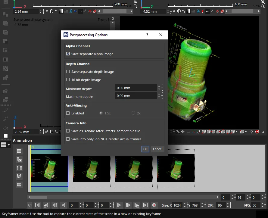
Anyone who has ever created an image sequence (.bmp, .jpg, .tiff) has encountered the "Post-Processing Options" in the Animation tool. They appear as soon as we press the red render button.
Among some other helpful options, the alpha channel can be found there at the very top. If we check the box here, we will create a matching image stack with 8-bit alpha in addition to the standard 24-bit RGB sequence.
We can then process these further with the program of our choice.
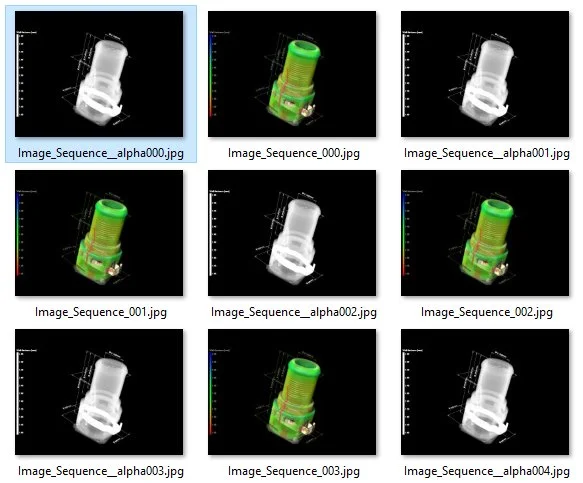
For each RBG image of the sequence, there's a corresponding alpha image generated.
After pressing the "render animation" button, a whole new world of different post-processing options opens up. Creating an alpha channel is just one of them.
Done
Isn't it amazing? With just a few clicks, we've created an official key visual and are now ready to launch an official social media campaign. Tell your followers!
Now say goodbye to sad, blurry screenshots and make your data shine!
Hello, social media, here we come! (Again, all logos and companies are fictional.)
Did we miss something? Or do you have an easier or more appealing way to create your images? Let us know!
Ready to Learn More?
Users of VGSTUDIO MAX can find out more about clipping tools, segmentation tools, and animation in the tutorials included in the software.
Got a Story?
If you have a VG Story to tell, let us know! Contact our Storyteller Team at: storytellers@volumegraphics.com. We look forward to hearing from you.
