
You've practiced, worked, and prepared your object for this big moment—now it's time to make it sparkle and shine for its front-page debut! In VG terms, this means playing with colors and adjusting light to really bring out the details.
Where There is Light, There is Also Shadow
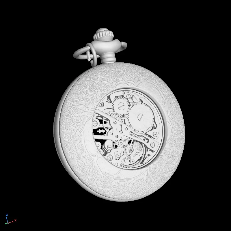
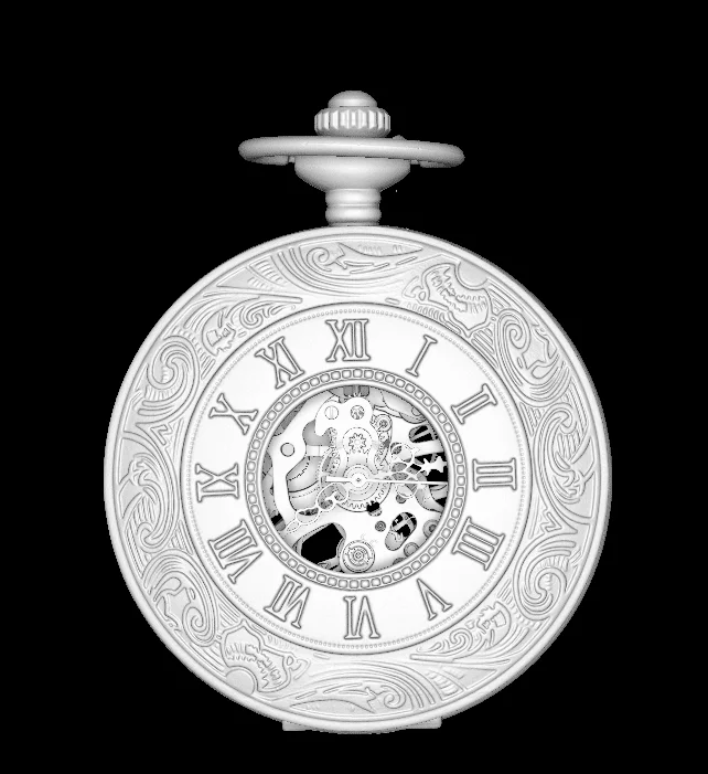
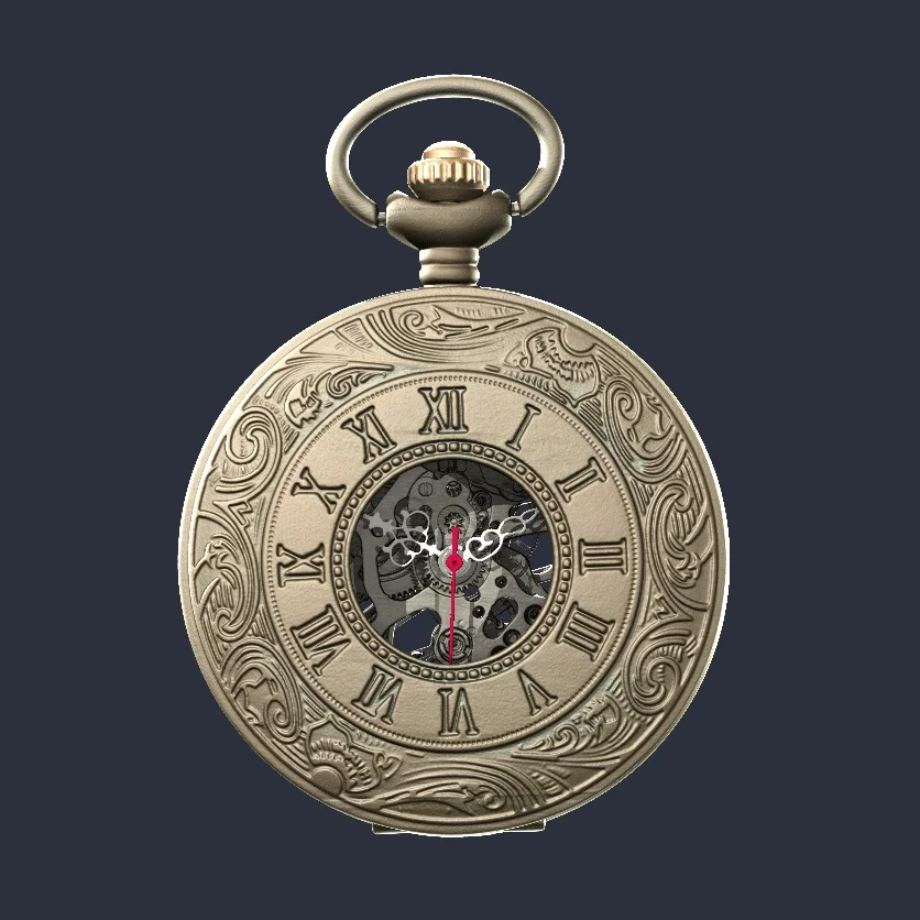
What we get when we open the pocket watch data set on VGSTUDIO MAX
Before we take a closer look at the data, let's try out a nifty new function of the software: ambient occlusion.
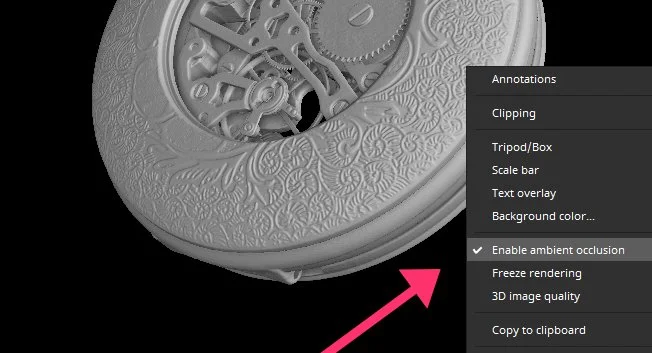
A quick checkmark in the context menu can now work wonders
Ambient Occlusion
With version 3.5.1, ambient occlusion (AO) has finally made its way into VGSTUDIO MAX. In essence, AO is a shading technique that gives depth and realism to a 3D object. Now, corners, gaps, and grooves appear a bit darker than the rest, which mirrors depth in real life. In addition, objects cast a pleasantly soft, delicate shadow on their surroundings. The best part? It doesn't cost any extra rendering time!
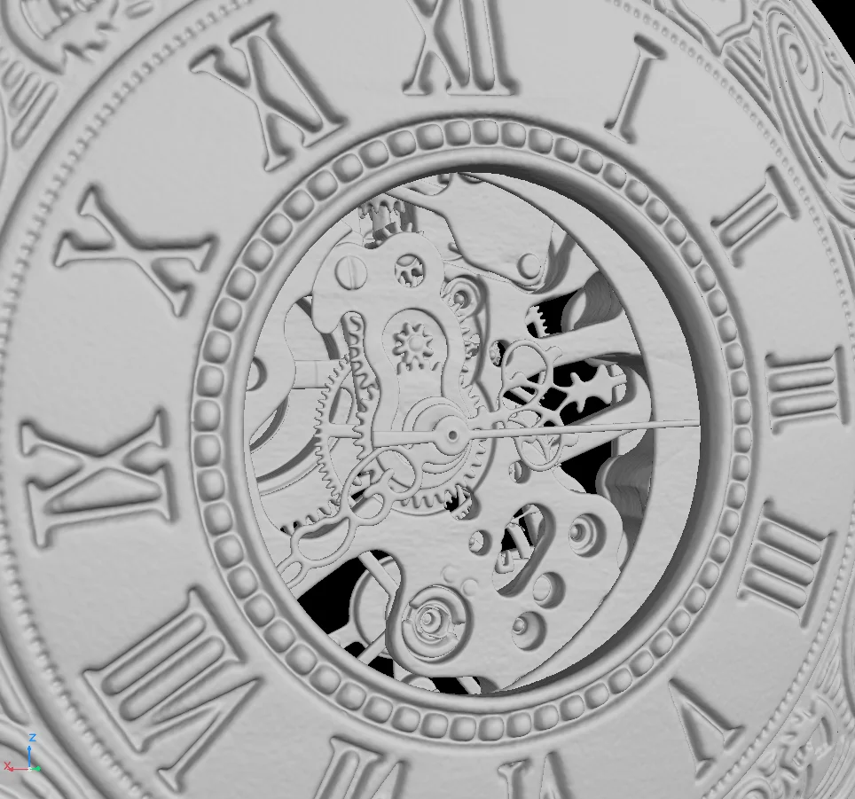
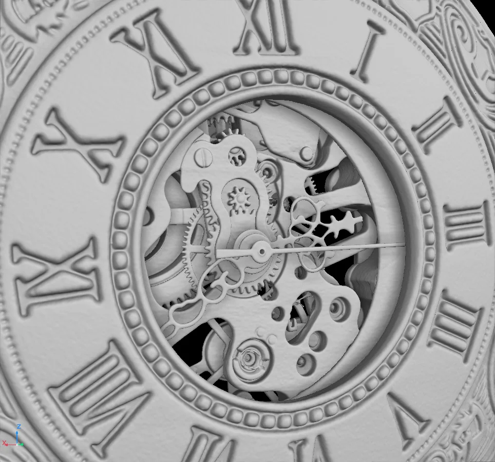
Check it out for yourself! Without AO (left), there is mostly the same shade of gray, which makes it difficult to process the different parts. But with AO (right), the object has more depth, and shadows cast by individual parts make them much easier to recognize.
By the way, the light sources themselves don't need to cast a shadow. AO is simply overlaid on top of the rendering as an aftereffect.
Picking Pockets... Apart
A pocket watch is made of hundreds of tiny parts that make it exciting to pick apart—quite literally! Let's do just that.
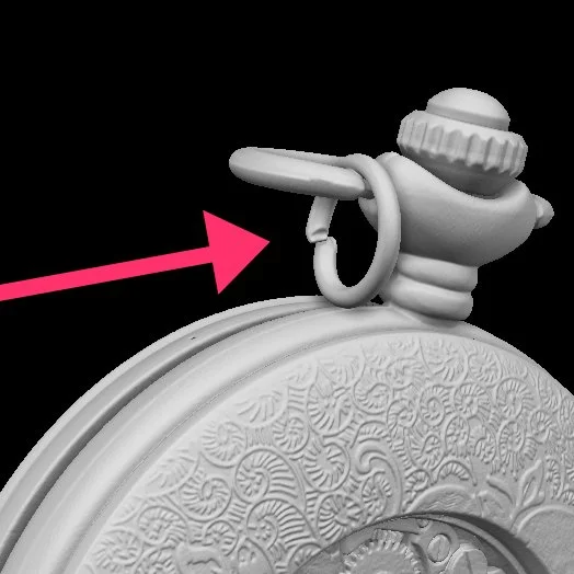
A small, bent-up ring. A remnant of a chain to which the watch was likely attached
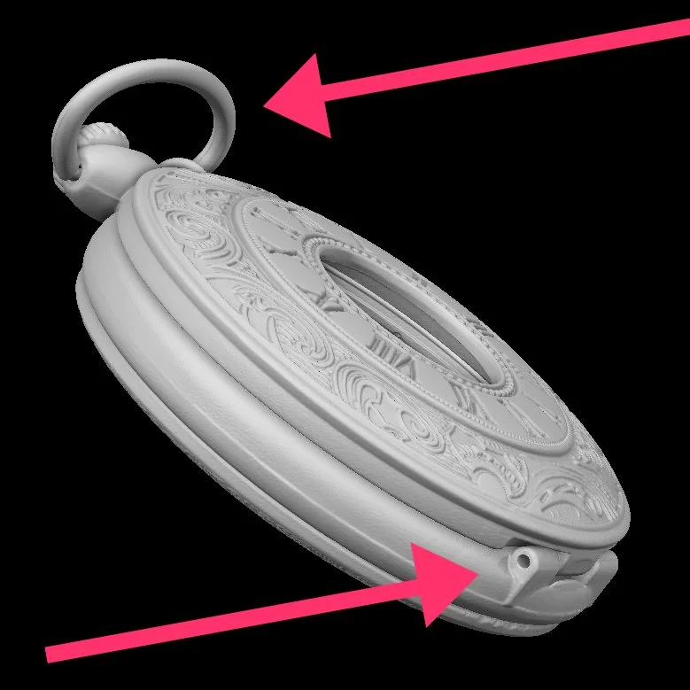
Above: a large ring, or the "eyelet." At the bottom, a hinge that holds the lid in place
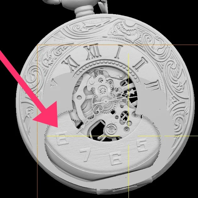
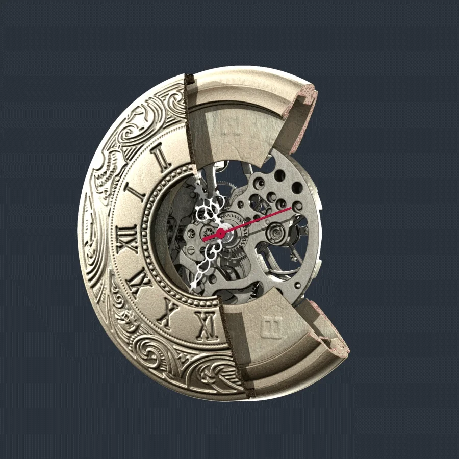
Secrets of the clipping plane: there is a second dial inside the clock that has a completely different, more modern style
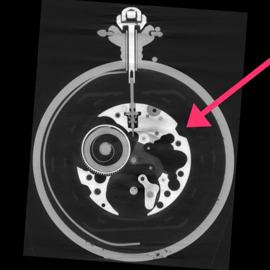
A cross section shows the watch's movements inside
A Bit of Tweaking
As they say, the devil is in the details, so let's make sure each part shows off its good side.

First, let's take out the small ring, since we can't find the original chain. We can create an ROI at its position and set its visibility to completely transparent. If we can't physically remove it, we can at least virtually disappear
Second, let's turn our sights to the bigger ring, the eyelet. We can unfold it and adjust its position, emphasizing the symmetrical character of the pocket watch

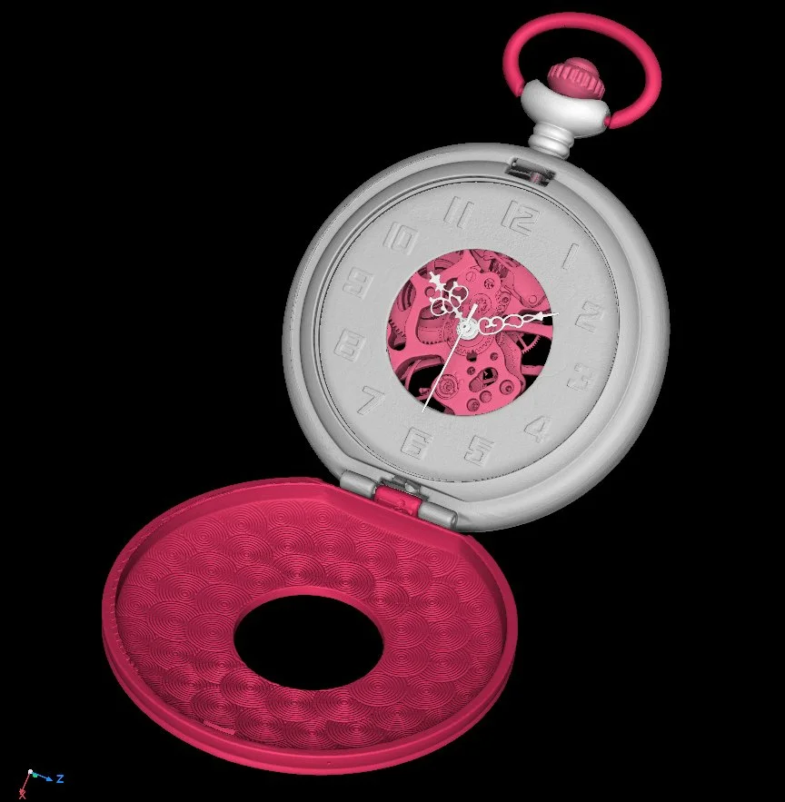
To see the inner dial, we need to open the case lid. We can simply create an ROI from it, which we can extract afterwards. Place the center at the height of the hinge to make the cover good to go!
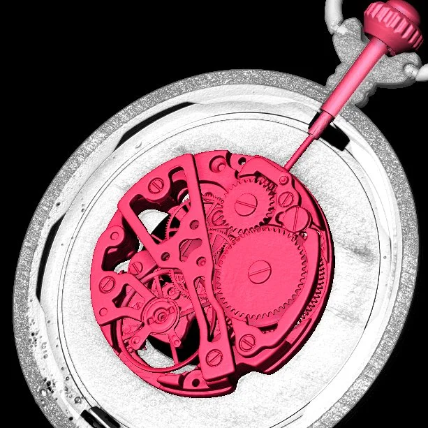
The clockwork looks fascinating. We can create an ROI from it to give it a bit of color

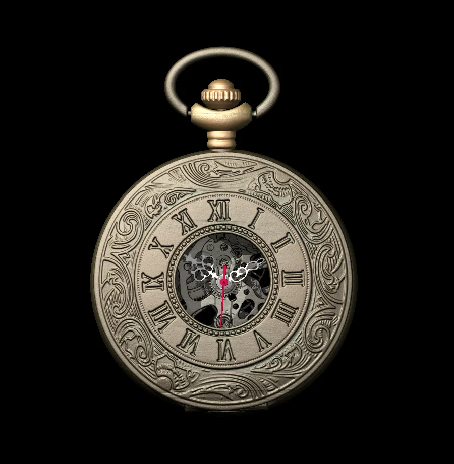
Did you know that watches in movies and ads are often set to 10:10? This gives the watch a a "happy face" and is least likely to obscure brand names. So let's do just that! We can segment each hand, extract the ROIs, place their centers exactly in the middle of the common axis, and rotate them until we achieve that Hollywood smile
Done. Adjustments (in red): check.
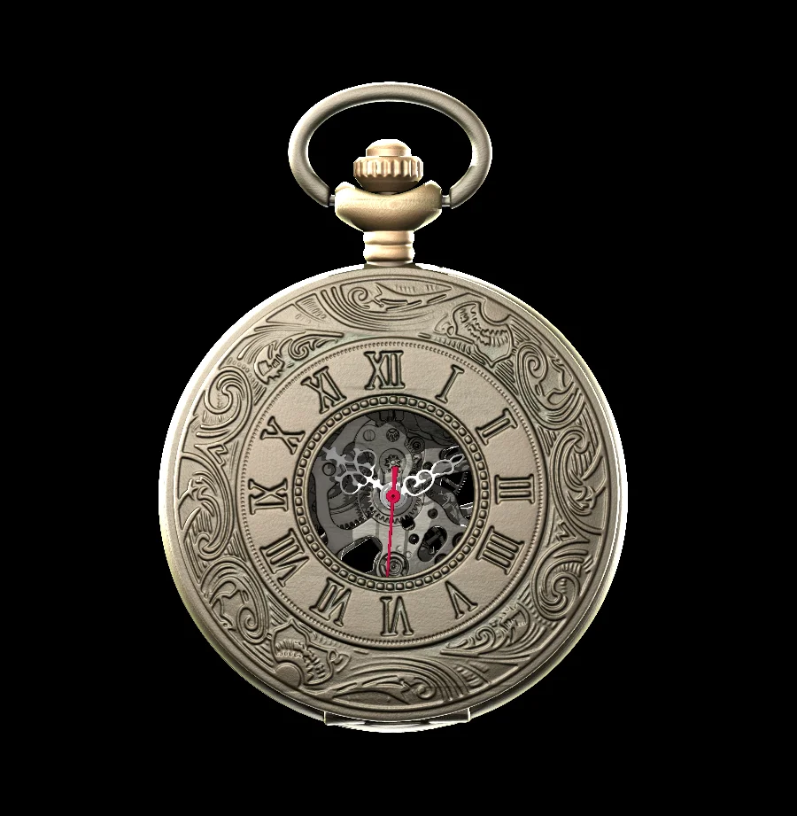
Material and Light
Render settings and lighting go hand in hand. For example, if an object is too dark, you can either increase the (ambient, diffuse, and specular) light emission in the object's material settings, or turn up the light. The effect is pretty much the same. The only difference is that the light also affects other objects, which may make them appear too bright. As such, let's start with the standard (material and light) settings and work our way from there to the desired result step by step.
We used these render settings for the metal of the pocket watch:
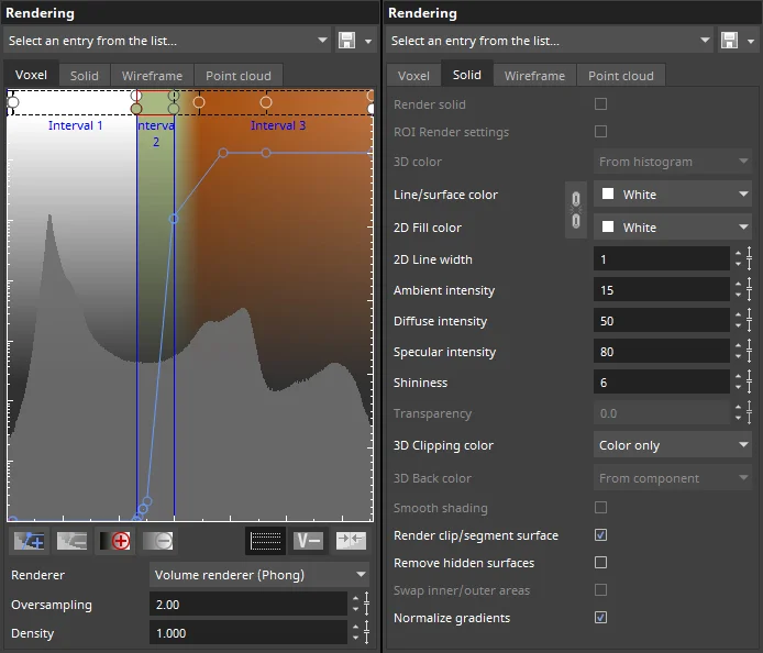
A mixture of olive green and light brown creates a rustic, timeless tone for the metal. Little ambient light is emitted (15), plus diffuse (50), supplemented by stronger specular highlights (80) with very broad highlights (6) for a brushed, matte look.
For the clockwork, we can use the same settings, but perhaps a little darker and less saturated.
The hands are a different story, as they contrast the clockwork sharply and are set to monochrome red and white.
In terms of lighting, let's give our watch a spotlight: there is a main light source diagonally from the upper left and, accordingly, a fill light diagonally from the right to soften the shadows.
Brushing up the Edges
If an object has a dark background (e.g., virtually in black space), it is important to brighten and emphasize the outer edges for a more natural, distinctive look. We can set a few edge lights slightly diagonally from behind. They accentuate the rounded edges of the case and visually separate the different depth layers.
See the difference?
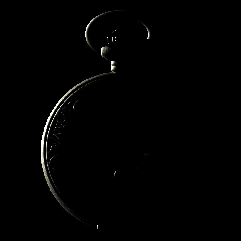
Edge lights from four different directions make the object stand out from the background
Lights, Camera, Action!
Since this is a small object, the default 40° position may make the pocket watch look unintentionally large. We can fix this by increasing the distance to the object and choosing a smaller camera angle, like in a telephoto lens (e.g., 20°).
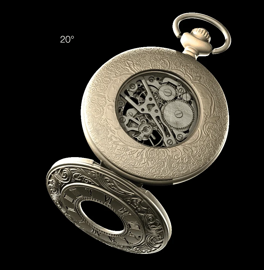
It's all in the angles: a slight adjustment makes a huge difference
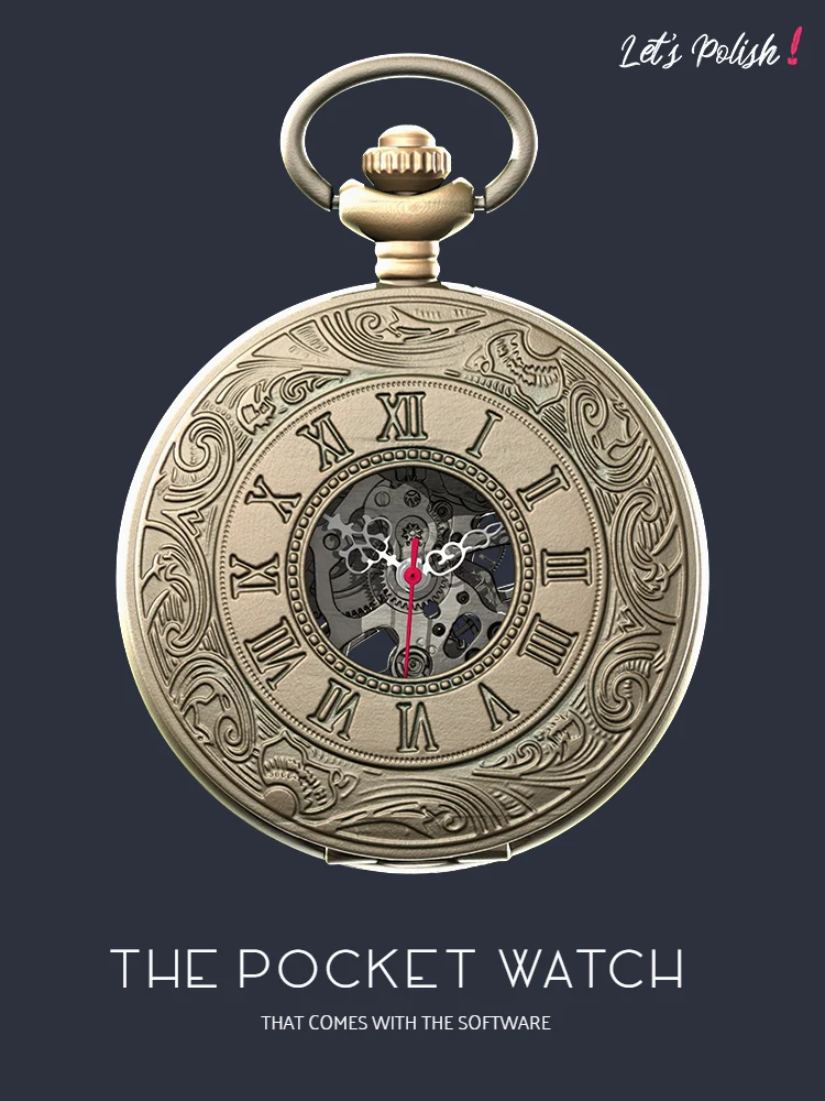
Our pocket watch is now picture perfect. Add a snazzy title, the right logos, and a background that brings out each loving detail. And the title image is ready.
Post-Credits: Work Hard, Play Hard
And of course, the outtakes.
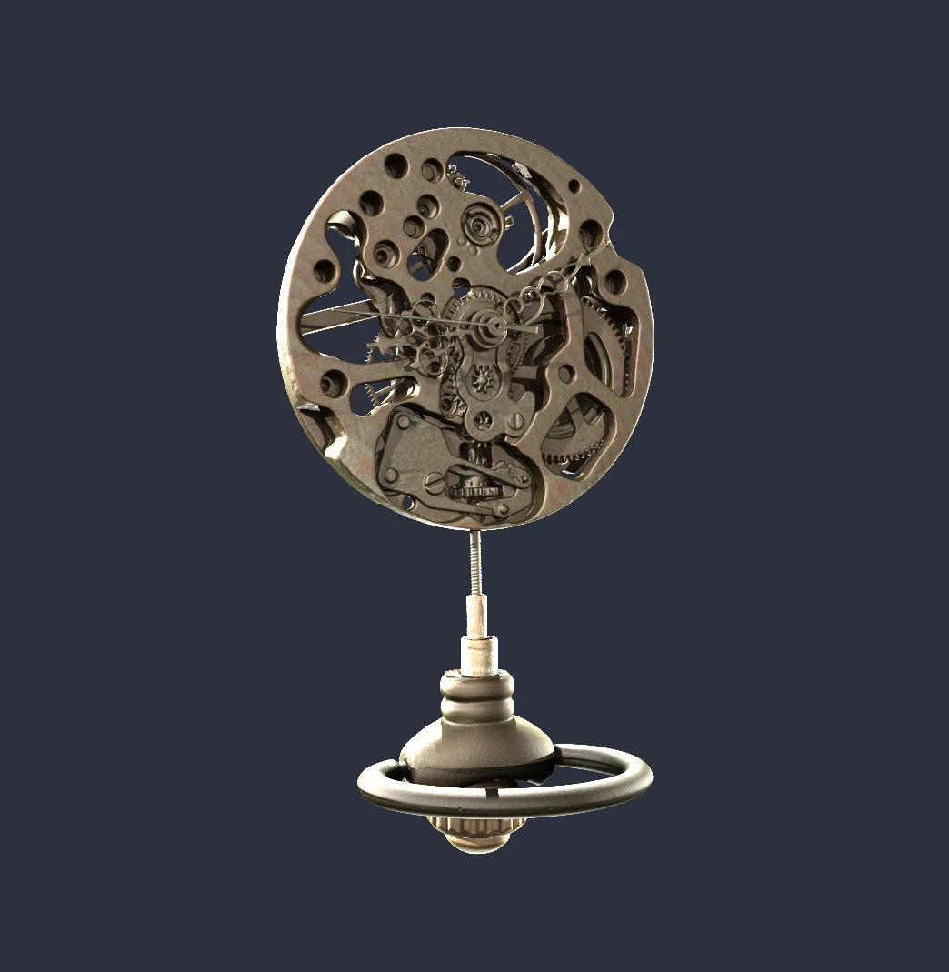
Clockwork on a stick

... from the back
Happy vs. Sad Face
And something that vaguely remembers a beloved video game character :)
Did we miss anything? Or do you have an easier or more appealing way to create your images? Let us know!
Ready to Learn More?
Users of VGSTUDIO MAX can find out more about clipping tools, segmentation, and animation in the tutorials included in the software.
Got a Story?
If you have a VG Story to tell, let us know! Contact our Storyteller Team at: storytellers@volumegraphics.com. We look forward to hearing from you.
